Different businesses have different requirements and ways to fulfill staffing, and that’s equally true for how we use the Workmate Client Dashboard. Over the past month, we’ve introduced a handful of tools and improvements that better fit Workmate to your way of getting things done. In case you missed it, here’s a brief walkthrough of how these features make your staffing and timesheet management easier.
Weekly timesheet view
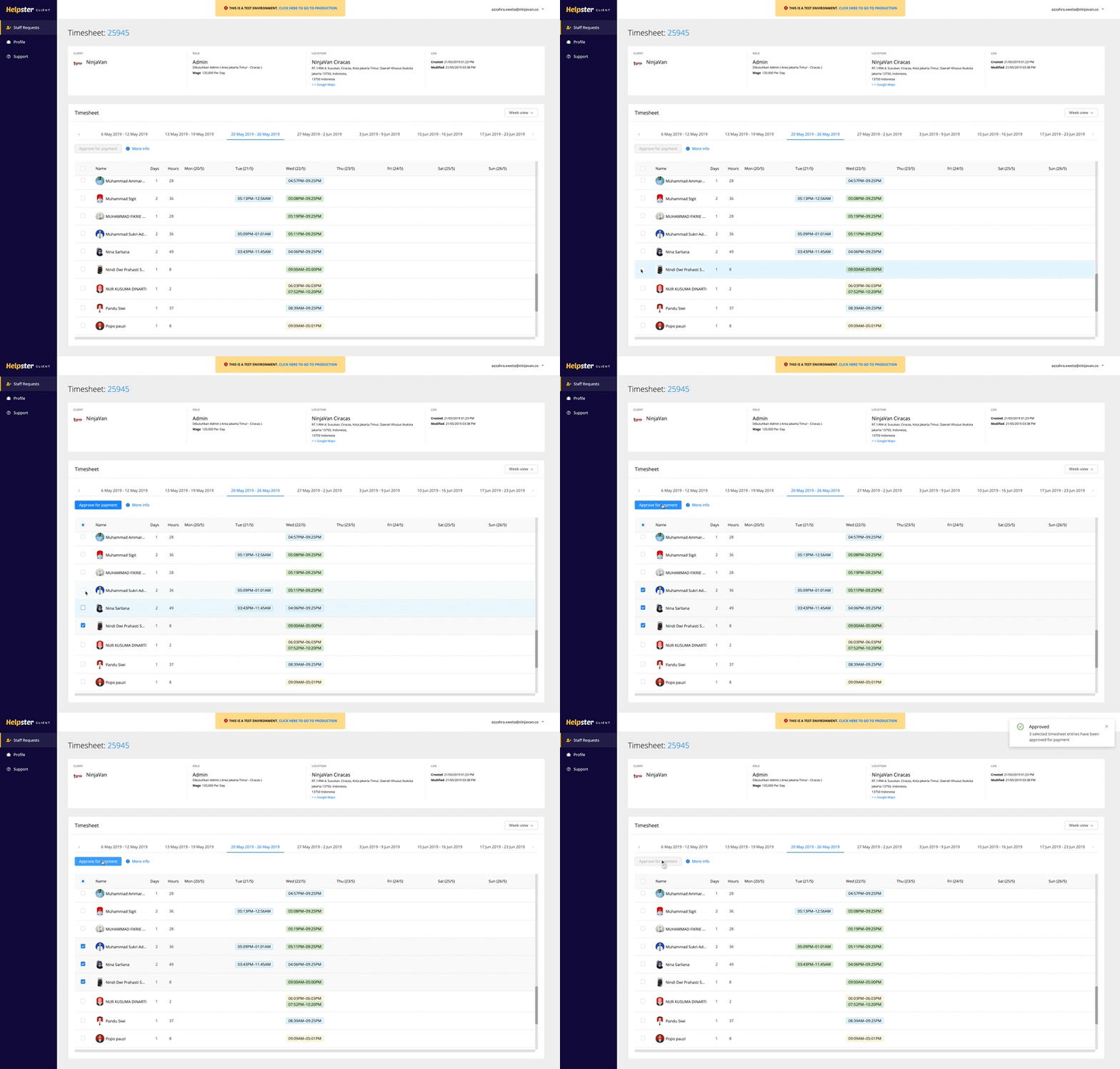
Wish there was a way to see a time-tracking format similar to the paper timesheets we’re all used to? There is now a weekly view where you can see all of a worker’s timesheets for the week, their total days worked, total hours, and absent days. Clear colour coding helps you see which entries need attention.

For anyone who needs a listed view, it’s still available. Switch between list and weekly view using the dropdown on the top right. Timesheets on the list view are grouped by status tabs, so that we know how many entries are still pending approval.
Speed up approvals with bulk selection

Timesheets really shouldn’t take up more of your time. Paper timesheets can now be clocked out for good! Workers will clock in on their app, then you can approve all workers’ timesheets for an entire week using bulk selection. Bulk approval will approve all non-disputed entries, so be sure to mark any timesheet entries that require attention first.

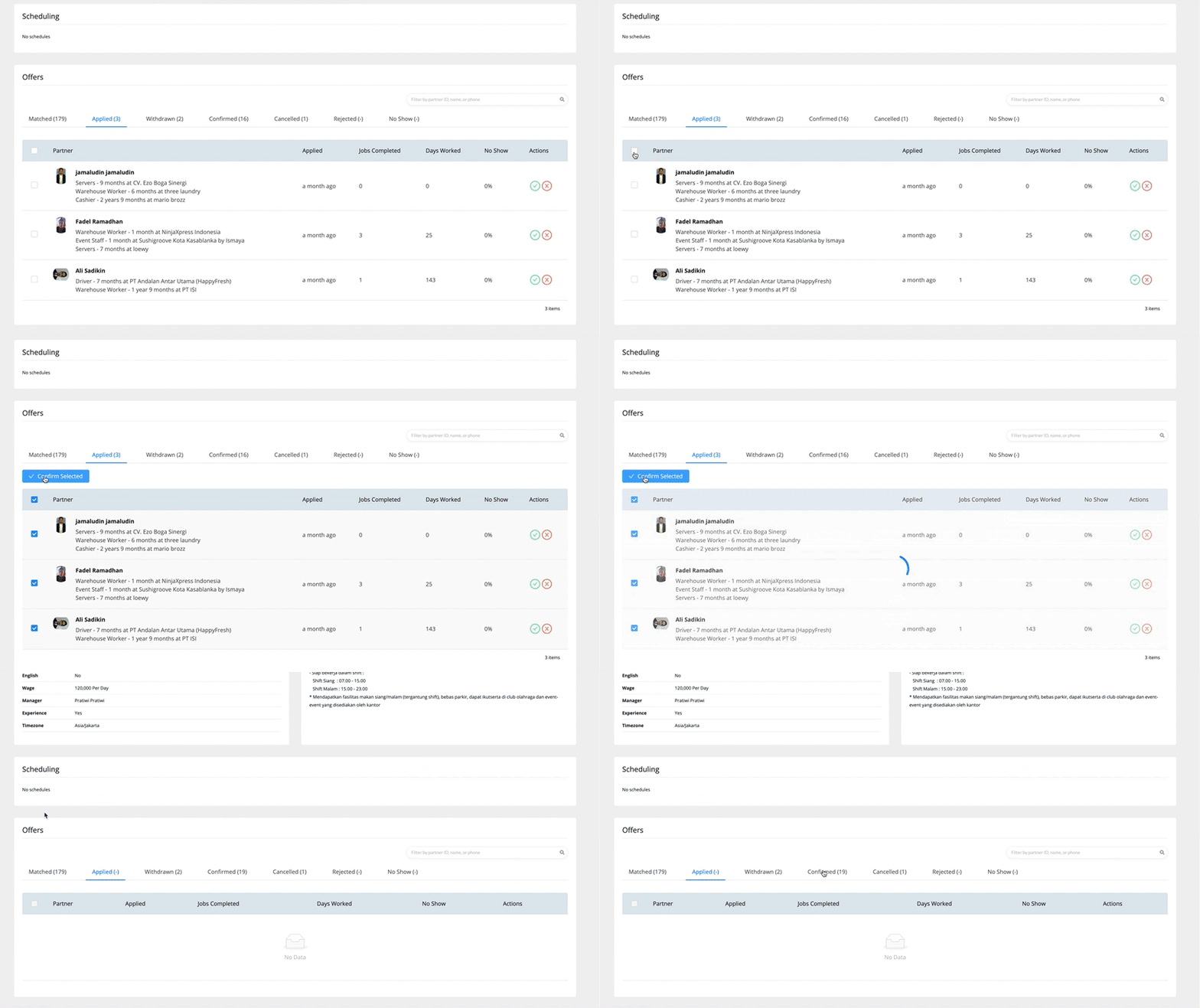
Likewise, you can confirm all applied workers in just two clicks. Our updated worker information display on the Offers page also help you see that you have the most qualified workers matched and applying to your Staff Request.
Fixes
Reorganised tab categories for Staff Request List
Previously there was a tab for each single Staff Request status (draft, pending review, posted, in progress, ended, cancelled), totalling to 6 tabs. Now—the status tags remain the same, but the Staff Request List page has been simplified into simpler categories. You can now quickly get to the most relevant Staff Requests first.
Improved validation on forms
The forms may have caused frustrations when it didn’t clearly state which compulsory fields were still blank—not anymore. Any incomplete compulsory fields are now clearly marked red. Clicking the ‘submit’ or ‘save’ button will also jump the page to these incomplete fields.
Do you have ideas for more improvements we can make? Many updates just like these come directly from customer feedback. Drop us an email to share your thoughts.

.png?ixlib=gatsbyFP&auto=compress%2Cformat&fit=max&q=50&w=50&h=50)

